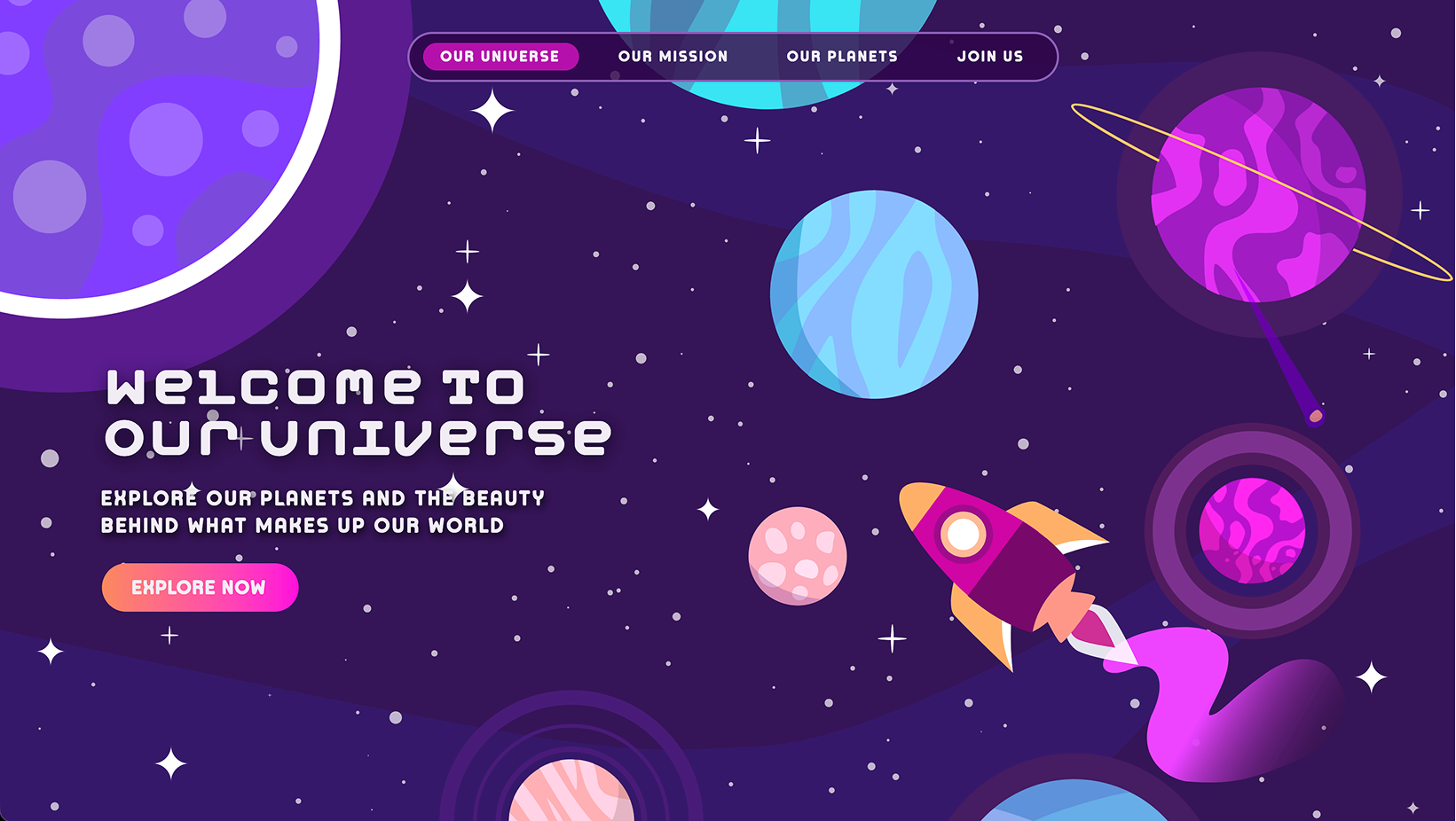
Your giant leap into the secrets of space.
Case Study
The Problem
Most modern space sites for kids have been sterilized to look clinical and lifeless just to fit a corporate style. Because of this, kids would rather scroll through TikTok or YouTube than visit a website to learn about space. On the other hand, the sites that do try to be playful haven't been updated in years, making them feel completely outdated in both their content and user experience.
"86% of educators agree that interactive, game-based digital tools are now essential for maintaining student engagement in the modern classroom."
The Solution
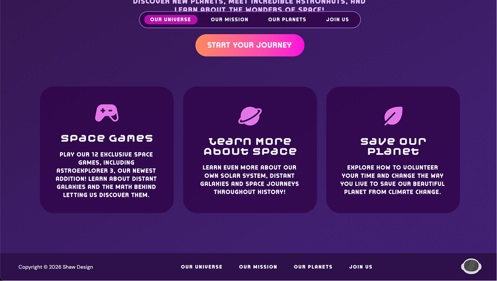
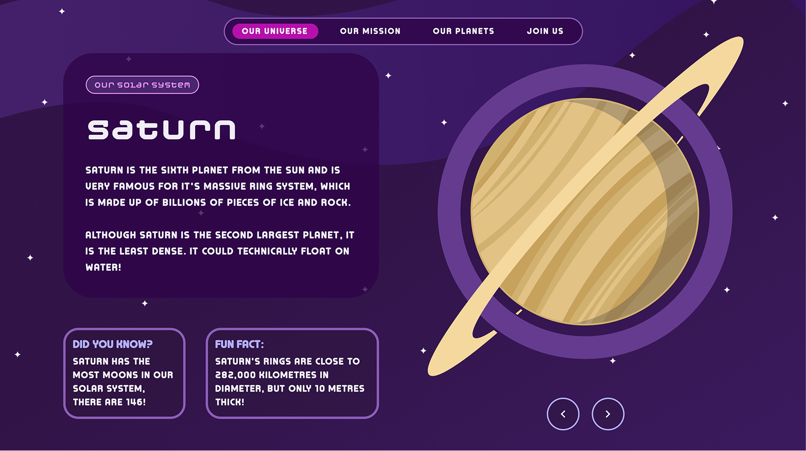
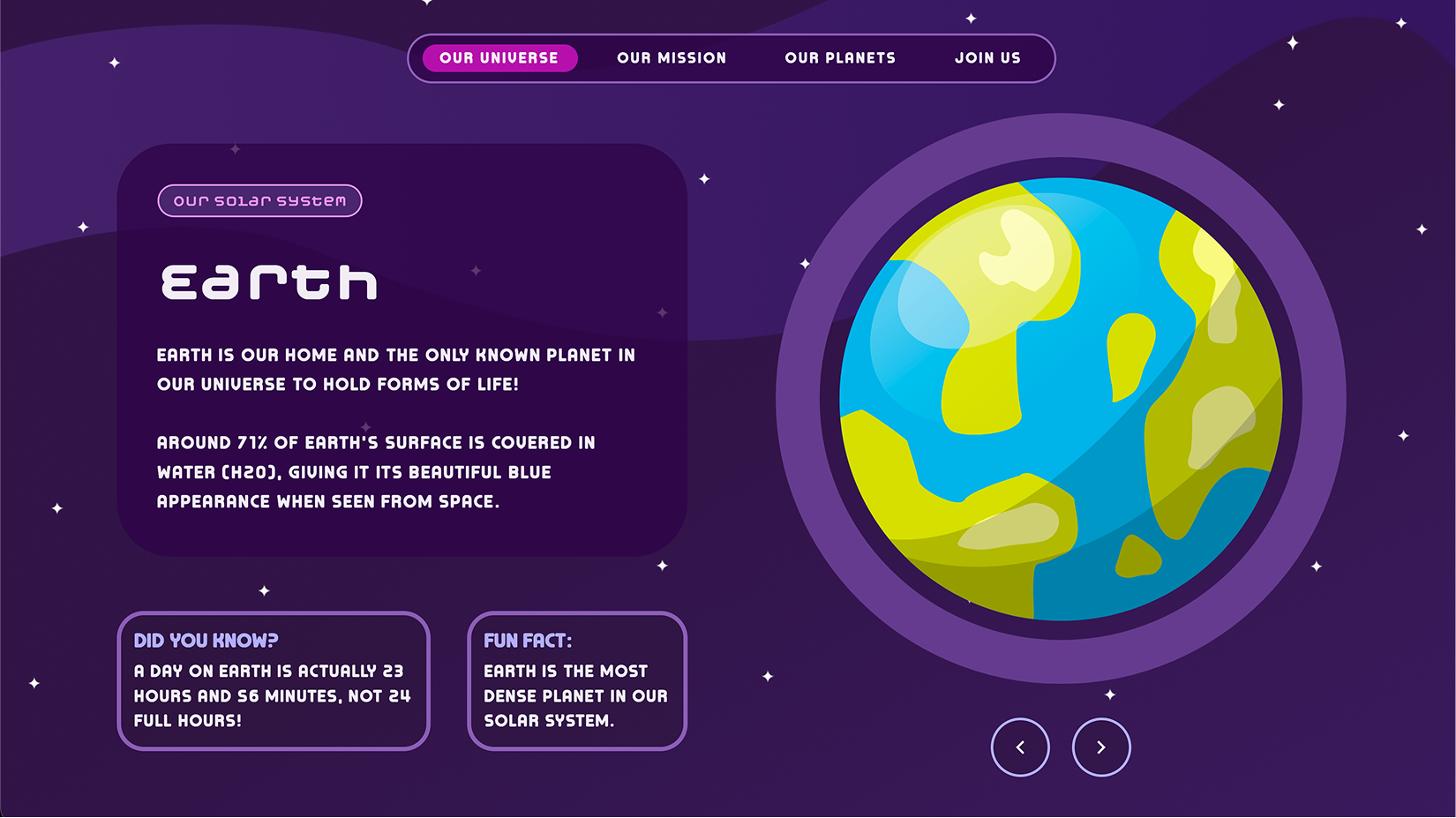
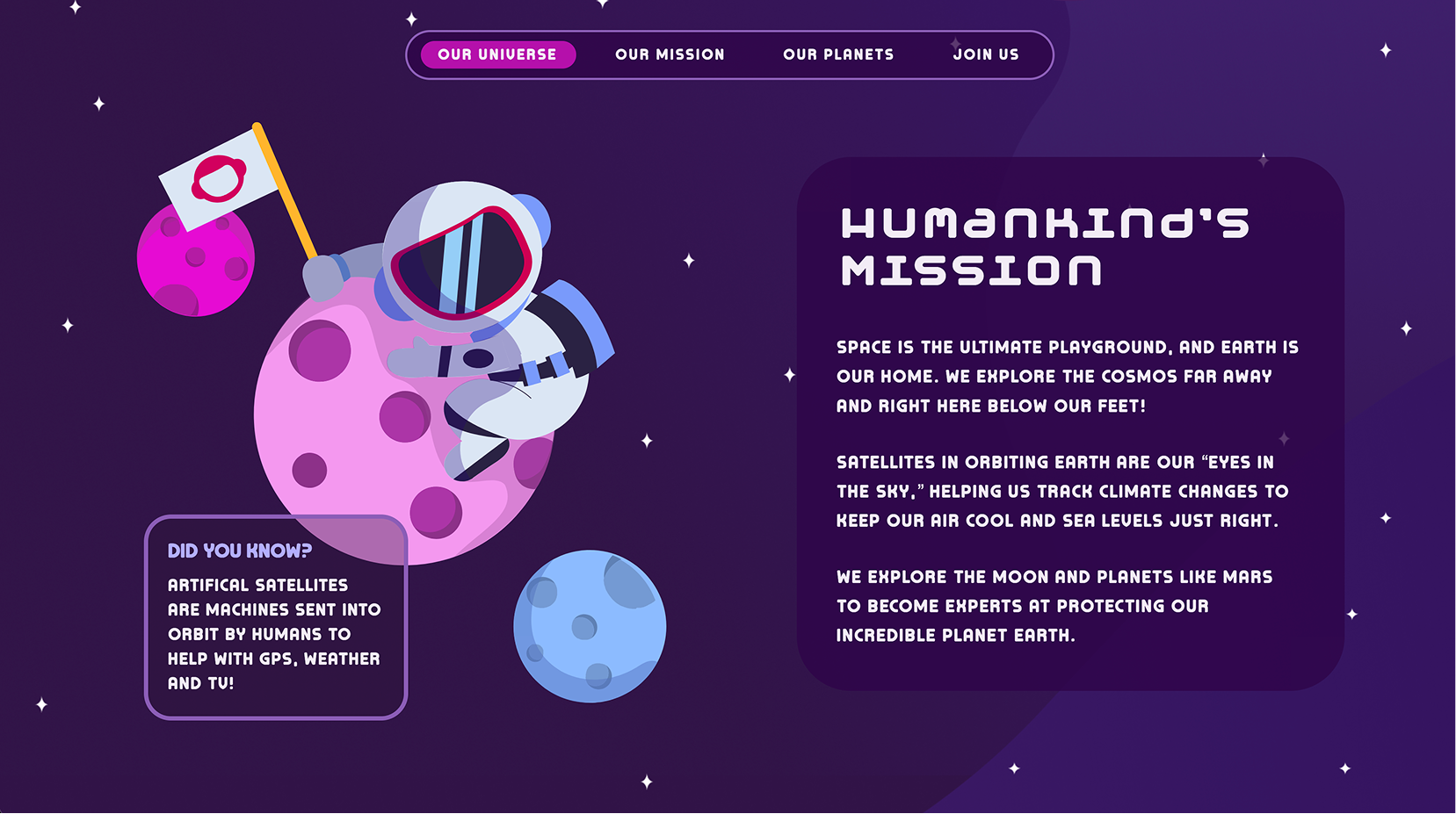
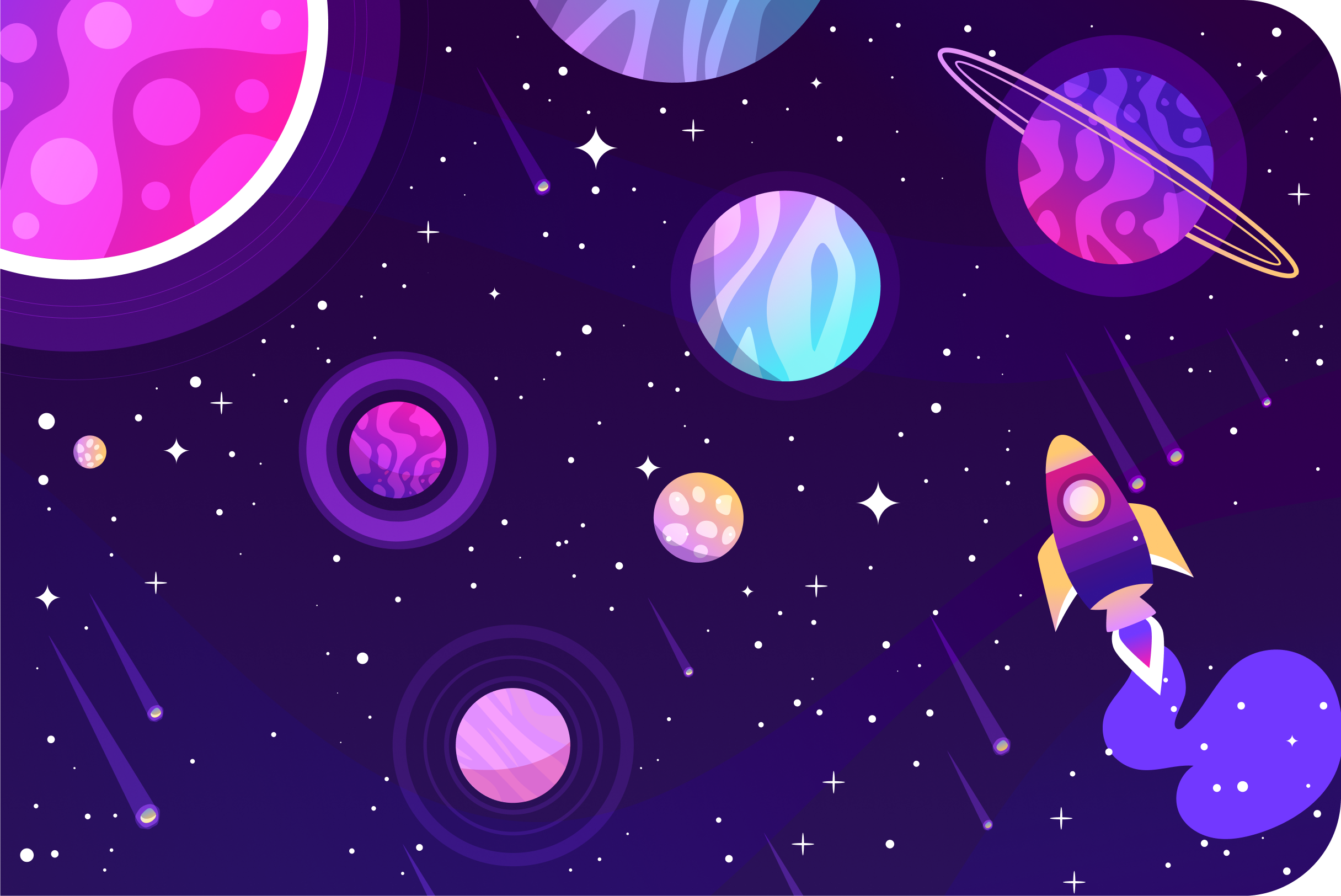
My solution was to take inspiration from the researched older, playful children's nature sites and rework them into a modern education landing page. I balanced smooth user experience with a fun, playful interaction style. By using a bold colour palette and Lottie animations, I created an engaging site that kids will actually want to explore while learning about space.
The Method
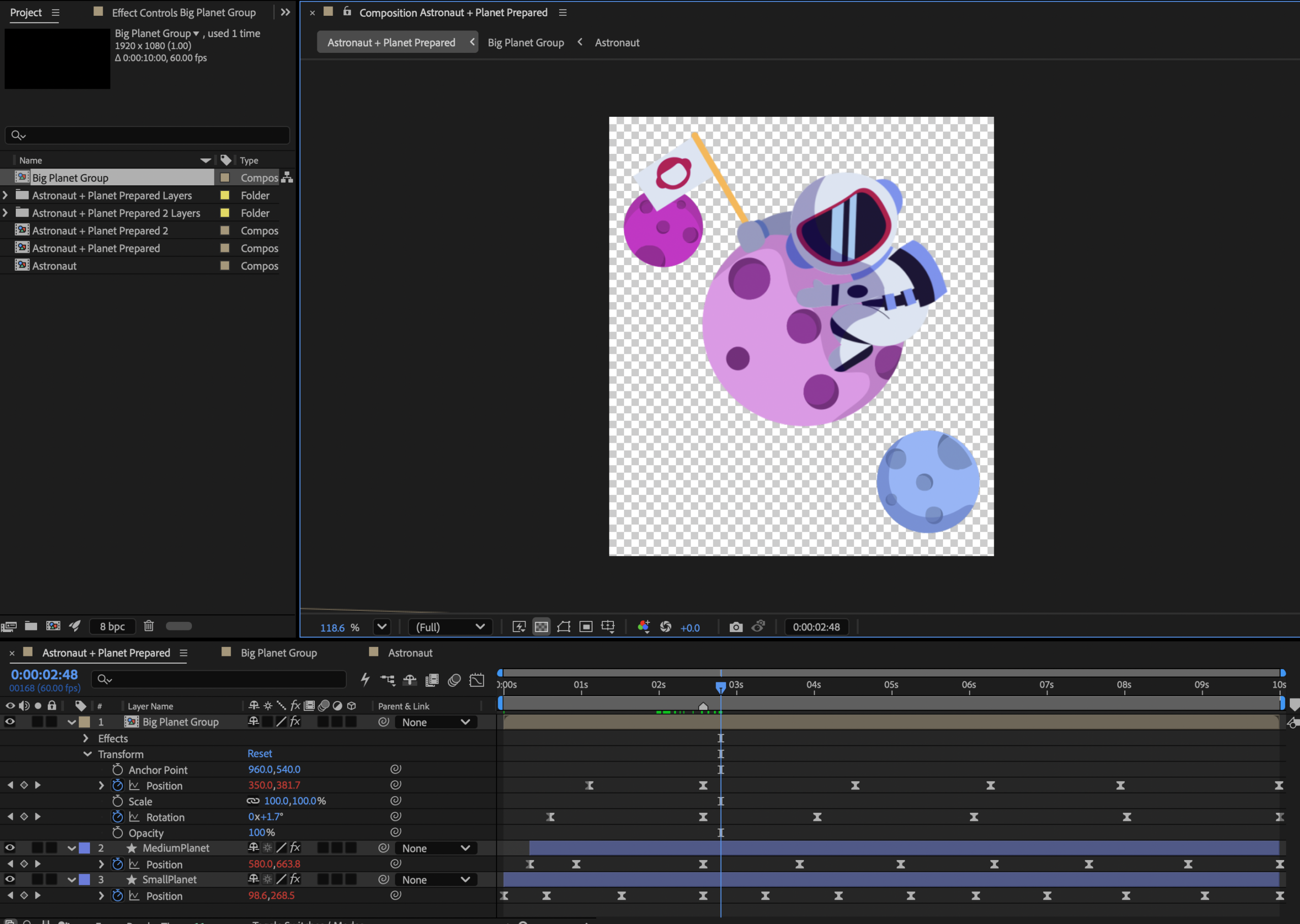
My process began in Figma, where I built out low, mid, and high-fidelity wireframes to solidify the site’s design while planning ahead for interactivity and animations. Once the layout was set, I ran the assets through Adobe Illustrator for SVG optimization, ensuring they were ready for Adobe After Effects.
In After Effects, I crafted three dynamic looping animations that included "build" sequences to give the site a playful and approachable vibe. From there, I brought the designs to life using JavaScript, HTML, and CSS. The finished product is fully responsive, energetic, and offers children unique perspective on space.
Skills Used
Project Showcase