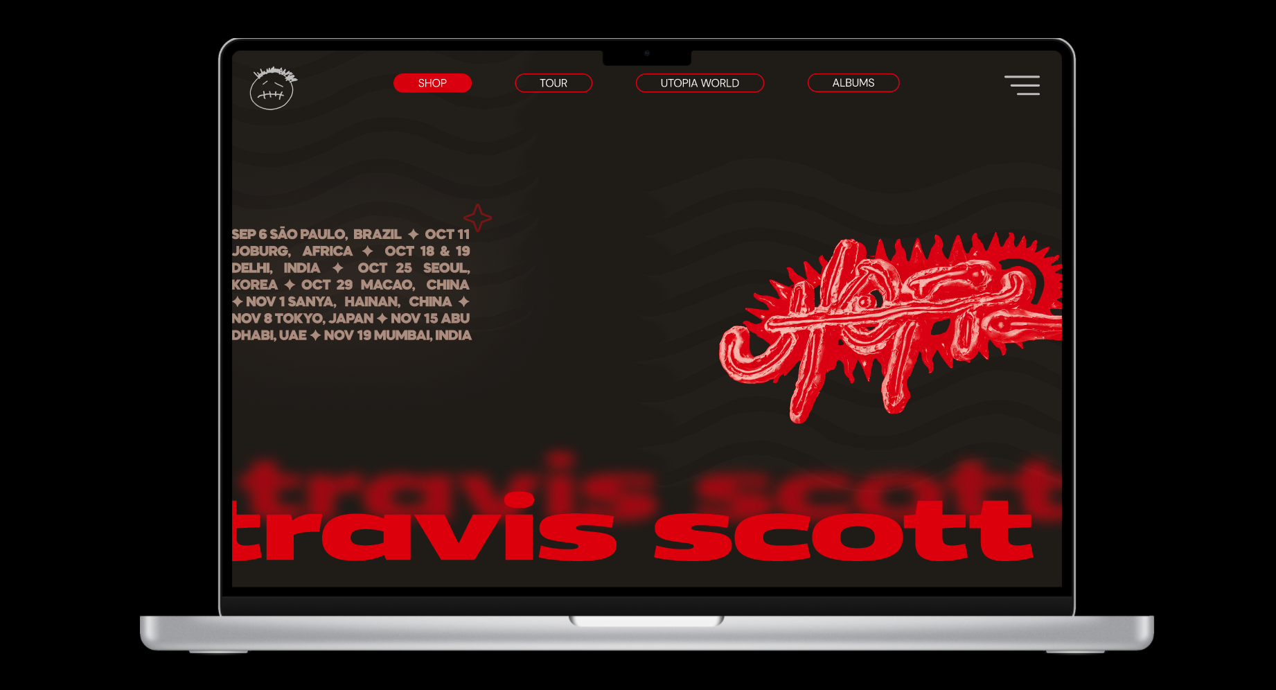
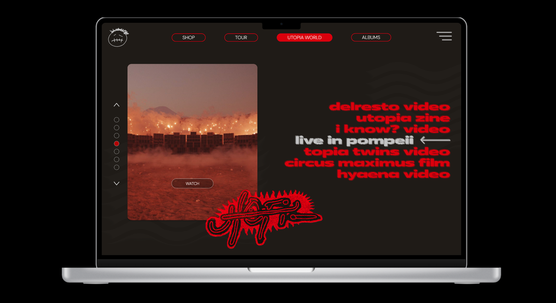
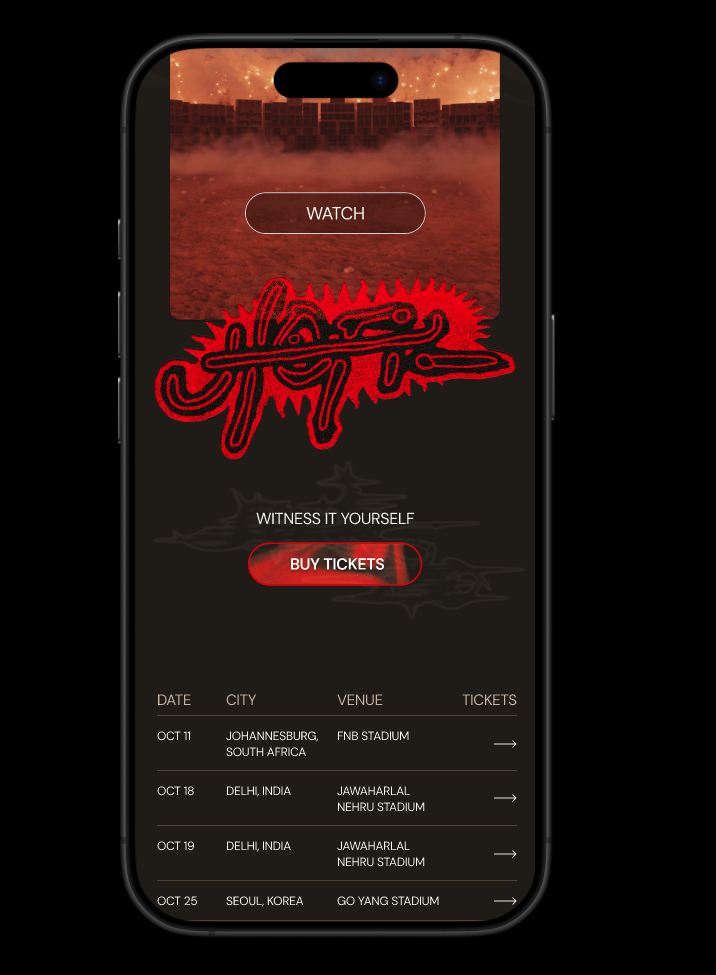
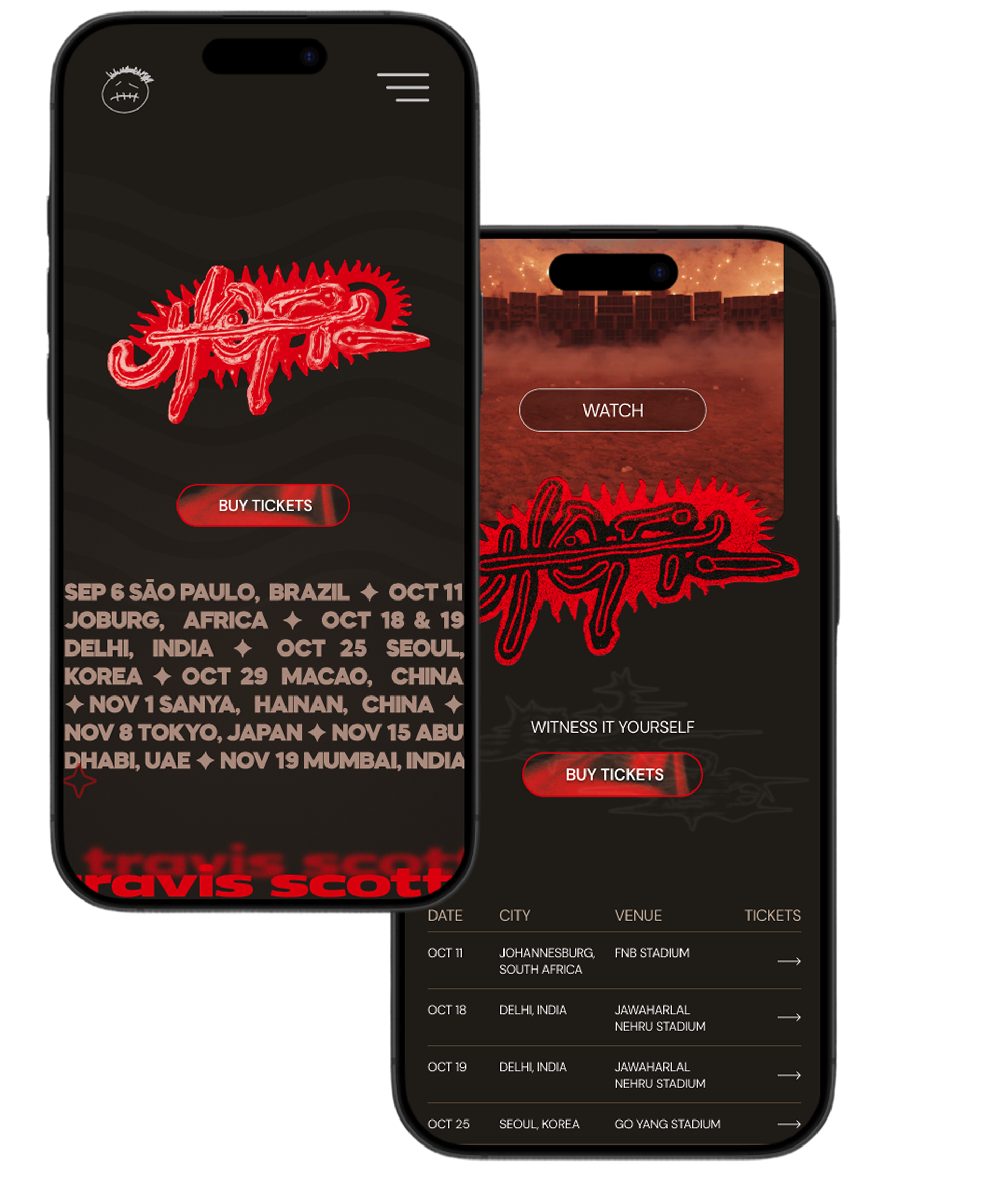
Reworked. Accessibly, responsively, stylishly.
Case Study
The Problem
Travis Scott's website around the time for his Utopia album roll out was unique in page layout and design, but neglected core accessibility standards. The site proved to be weak in responsiveness, and desktop designs failed to translate to mobile layouts effectively. Additionally, unoptimized assets led to high latency and sluggish page transitions. The site's layout was confusing in nature, and difficult to understand for even experienced tech users.
Jakob's Law states that "Users spend most of their time on other sites." This means users prefer your site to work the same way as all the other sites they already know.

The Solution
My solution was to reimagine and develop a digital experience that honours the brand’s signature maximalist aesthetic while prioritizing responsiveness, accessibility, and usability. By building the site from the ground up through the lens of Jakob’s Law, I was able to connect Utopia’s abstract elegance with functionality, resulting in a beautifully cohesive and inclusive online experience for all users.
The Method
To achieve this desired result, I began by drawing inspiration from Travis Scott’s broader creative world, including his merchandise, set designs, and colour palettes. This led me into mid-fidelity Figma wireframes, to block out a functional and accessible structure. These were followed by high-fidelity designs which incorporated custom typefaces and assets.
During development, I used SASS alongside JavaScript to build the dynamic site. Integrating an AOS (animate-on-scroll) library allowed me to add immersive motion while maintaining strict accessiblity standards.
Skills Used
Project Showcase